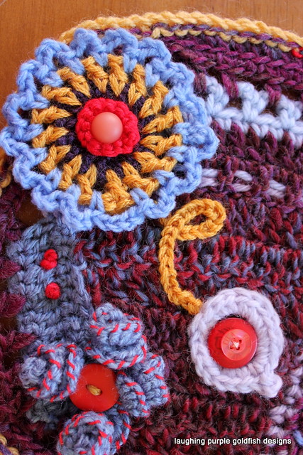
Here's the brief for the Final Swap Scrumble:
"I also like rich, jewel tones. I really like color combos that are primarily cool with pops of contrasting colors. For example, a blue and purple based scrumble with pops of gold and orange.
I do not have a project in mind for the pieces I receive. I will likely just display them individually as pieces of art in my craft room."
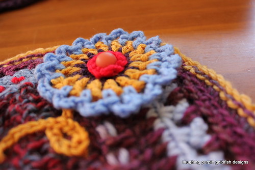
Once again the purpley tones have not photographed in true colour... One day I will figure out why that is - but in the meantime it will continue to drive me MAD!

2 comments:
Try a green background to make your purples truer to color. It works because green is the complementary color to purple.
Great scrumbles, BTW!
Excellent tip thanks Loren - definitely trying that next time!
Post a Comment